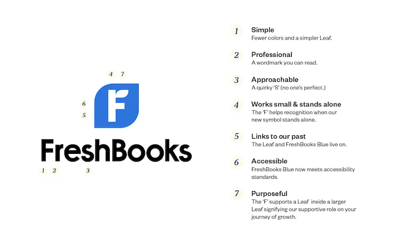
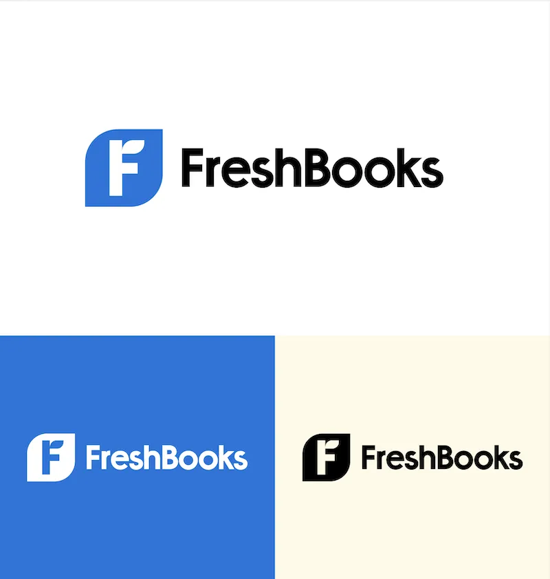
FreshBooks launched a new logo and updated our look.
TL;DR We have a new logo.
FreshBooks launched a new logo and updated our look. We’ve lived with our old logo for nearly 15 years and it’s worked hard for us. We liked it, our first designer Jeff designed it back when we were working out of our founder’s parents’ basement. We still like it.
But we’re updating it. We thought we’d tell you more about how we created the logo and what we learned along the way.
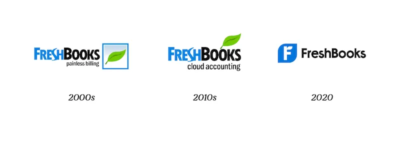
The evolution of the FreshBooks logo, from 2006 to now.
Why Did We Change the Logo? It’s Part of Our Commitment to You—the Business Owner
Logos are an integral part of communicating who you are as a company; friendly companies want to look friendly, sporty companies want to look sporty. Whatever your company stands for, your logo is an essential communication element.
When we looked at our logo, we didn’t feel we were communicating what we stand for, where we’ve been or where we’re going next.
FreshBooks stands alongside business owners. This logo change represents a renewed commitment to you, our customer, and a recommitment to our purpose to stand beside you on your journey of growth.
Where Do You Start? (Re-)Discover Your Purpose
Logos help intuitively convey who you are as a company and how you show up in the world. Your logo ought to show what you stand for; a.k.a. your purpose. For FreshBooks, it’s quite simple: To stand beside you on your journey of growth.
To get this right, you need to make sure your purpose is being lived by your company every day. So we started from the inside and worked outward. To do so, we followed these steps.
Step 1: Find Truth in Your Proudest Moments
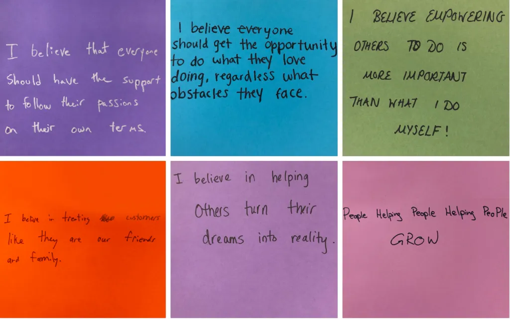
Before doing anything new, we asked FreshBookers about their proudest moments. We ran a series of internal workshops where hundreds of FreshBookers shared their proudest moments, then we asked them to distill them down into belief statements like the ones below.
These statements became the North Star for everything that followed.
A small sample of the belief statements generated by FreshBookers from their proudest moments.
Step 2: Write It Down
With those truths in hand, we worked on our purpose statement. You might already have a mission and a vision written down somewhere, and it may seem awkward to have yet another statement (it felt weird for us at first too).
Your purpose is different though: It’s not about what you’re going to do or how, it’s about why you do it.
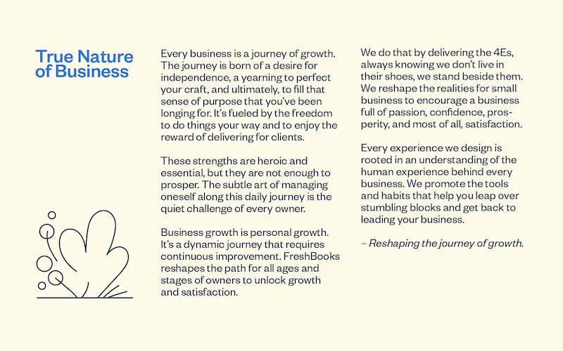
In many ways, our purpose was written before, in unexpected places—in T-shirt slogans, murals, and blog posts—but we needed to distill it in a single place. We started by writing it as a story instead; we called ours the True Nature of Business (you can read it below).
It was difficult to write our purpose as a short statement so we started out by writing it as a story instead.
There are several great tools to help companies do this type of work but no replacement for the work itself. If you have some time, check out Zag by Marty Neumeier, or Start with Why by Simon Sinek.
Step 3: Try It On
Next, we wanted to ‘try on’ our brand story and purpose to make sure it fit well.
So we decided to host a cross-company ‘brand fair,’ where FreshBookers presented dozens of concepts of their own creation; things like enhancements to our product, how we market ourselves, and even our office operations.
Left, FreshBookers present their ideas at our first-ever ‘brand fair.’ Right, longtime FreshBooker Grace Antonio takes the top spot for her idea to help customers save for retirement.
Designing Your Logo: First Define the Problem
Now, to make that brand show up in your logo and identity. Before you push a single pixel, you need to define the problem. For us that meant identifying issues with our original logo, noting what we wanted to keep, and clarifying how it was holding us back.
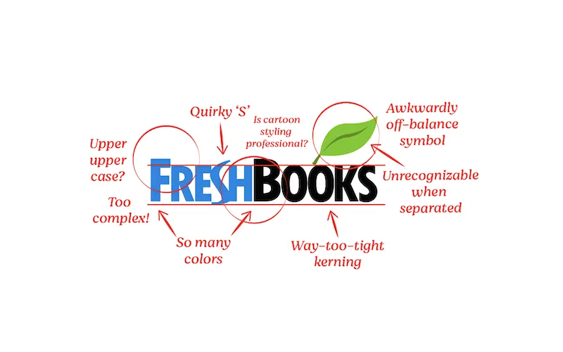
Here were the problems the original FreshBooks logo presented:
- It had too many elements, we wanted to simplify and enhance its clarity.
- While organic and humanly imperfect, our original logo did not meet our professional standard, or yours.
- Our core brand colors weren’t accessible. As a company, we’re committed to inclusion.
On a more positive note, we wanted to retain some of the heritage or our original design. And, most importantly, our new logo needed to clearly communicate what we represent: Standing beside business owners on their journey of growth.
Our original logo had some problems and a few lovable quirks too!
Designing Your Logo: Lots and Lots of Exploration
Now the fun part… developing visual concepts! We worked with FreshBooks customers Son and Sons to help us out.
Our exploration started by looking at what we had designed over the years, what worked, and what didn’t. We also looked at:
- Our competitors and what they were doing (in no small part to ensure we stood out against them)
- Companies outside our category that we admire
And we tried on a lot of different looks:
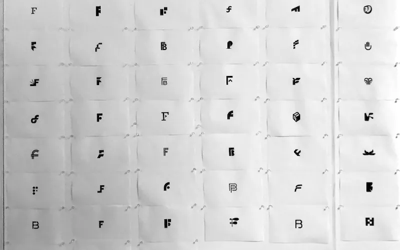
We looked at hundreds of symbols for our new logo.
Finally, the work landed in a good spot. Yes, familiar, but it just felt right.
Do You Just Launch It? Nope, Test It
Creative work can often become very personal. So getting external feedback helps keep decision-making balanced. To test our decisions, we ran a test campaign in Texas with the help of our friends at Ostrich.
The response was great, and people loved the logo. It hit the targets we wanted to hit and people understood what we were saying.
What Do You Do After You Launch? You Live It
When all is said and done, a logo does not make a brand. A brand is built by the experiences a company creates: How you treat your customers, the people you hire, your suppliers, and partners. Your purpose is only as good as how well you live it.
So, along with introducing our new logo, FreshBookers continue to behave in ways that show we stand beside business owners, each other, and our partners.
- We’re updating our core brand colors in our product to serve you better. Our blue navigation and text links, and green buttons now meet AA accessibility standards. We are also working to make our entire platform more accessible in the coming months.
- Throughout the pandemic, over 50 FreshBookers have participated in Roll Up Your Sleeves, a volunteer-led program to reach out to customers affected by COVID-19 and give them free consulting services to help keep their businesses going.
- We continue to publish eBooks, data reports, and blog content, to help your business grow.
- Our engineering and product design teams are growing fast to bring improvements to our software.
- We continue to invest above and beyond companies our size in customer service and support. We’re now eleven-time Stevie Award winners and three-time Nice Reply Customer Happiness Award winners.
- We invest in the development of our employees and the environment they work in every day—and have been recognized as one of Toronto’s Top Employers for this.
Our commitment continues and our job is never finished. Even as we stand beside you, we too are on a journey of growth—and we couldn’t ask for better companions.
P.S. Though we’re announcing the new logo, rolling it out across all our experiences will take some time. If you spot the old logo out there, please shoot us a note and help us wish it well on its journey to a more restful place.
Written by FreshBooks
Posted on October 13, 2020
